Puma's World Cup font 2018
We keep dig into the font's fantastic world
Sports
April 4th, 2018
April 4th, 2018
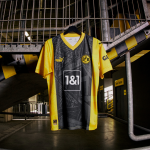
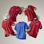
World Cup 2018 did not start under the best auspices for Puma. The German brand lost many of the teams sponsored during the preliminary phase - including the Azzurri - remaining represented only by four national teams: Uruguay, Switzerland, Senegal and Serbia, which left Umbro only two weeks ago. Puma has already presented all the official shirts except the one from Senegal: they do not show any particular distinctive signs, the designs are all very similar and sober focused on the classic national colors. Regarding the fonts used on the shirts they opted to use the same on all the teams.
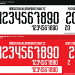

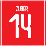
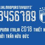
The style of the Puma 2018 font is industrial-inspired with elongated shapes and four geometric recesses on the sides. The only exception to the style of the font was made for the numbers of the Italian national team: they are filled in the center with a full-bodied line interrupted by the four stars represented the World Championships won by the National team. A pity not to see this particular font on the blue jerseys to the world, as the trend seems to have taken hold even in the headquarters of Nike that two weeks ago presented the font dedicated to Brazil, France and before England. adidas has instead received some criticism for the squared graphics of the retro font inspired by Russian visual art.