Umbro's finest
All the creativity of the brand in the new Cruzeiro and Gremio's shirts
March 6th, 2018
If you think football shirts look more and more like each other, you're not alone. Nike and adidas dominate the football market and influence its aesthetic. In recent years, the two brands are progressively reducing the diversity of uniforms between the clubs: Nike has used the same timeplate for all the third kits of its teams this year, adidas for the World has focused on the revival, Macron - the brand that grows more, behind the two giants - it never loses itself with innovative designs. The most innovative brand in terms of aesthetics is Umbro, which goes against the homogenization of uniforms: it offers original designs for each club, which tell the story and respect the aesthetic tradition of the team. The last two examples of this philosophy are two shirts just arrived from the Brazilian championship: the Grêmio and the Cruzeiro.
Grêmio
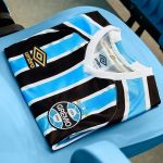
For the club from Porto Alegre, Umbro chose the classic columns design, using the original eblue-black-white color palette. Some details - including the Umbro logo, a small stripe on the sleeves and a small logo to celebrate the club's 115 - are made of gold. There are three other details that make this shirt unique:
- The last part of the sleeve is white with the rhombuses of the British brand printed
- The Uber sponsor within the numbers
- The half Umbro logo on the inside of the numbers
Cruzeiro
For the club from Belo Horizonte, Umbro offers a fantasy that pays tribute to the club's graphic history. The original name of the team was Società Sportiva Palestra Itália: the emblem was a rhomb with the initials SSPI. In 1943, in a competition with São Cristóvão, the club began to use a new emblem: a blue circle with five white stars inside, symbolizing the arrangement of the stars in the Southern Cross. Cruzeiro placed on the five-star blue uniforms on all the bust. Since 2004 the five stars became the real team logo with the addition of a circle and the word "CRUZEIRO EXPORTE CLUBE" around. The idea of Umbro seems to be that of honoring the tradition of club aesthetics with a star-shaped fantasy that expands across the top of the shirt. The deep blue colorway amplifies the sky effect and makes the five stars on the chest - free from the circle of the emblem designed in 2004 - free as a constellation. As for the Gremio, the detail of the end of the sleeves is a touch of remarkable class.


