Life of a font
The english designer Craig Ward tells the story of new England x Nike's font
Sports
February 20th, 2018
February 20th, 2018
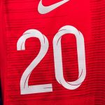
One of the most original components of the football shirt is the font used for numbers and names. For majority of football obseed it is just an irrelevant detail but for typography lovers every number's line or letter contains talent and artistic brilliance. Two weeks ago, Nike presented the new shirt of the British national team for the World Cup in Russia: a very classic and traditional design was matched with a very original font, created specifically for the English shirt by the world-renowned graphic designer Craig Ward, famous for his work with major brands such as Mastercard, Calvin Klein and Wired.


In an interview with Creative Review, Ward told the whole creative process of font design, from commission to final approval. The English designer - a great football fan - was about to miss the chance to design his national fonts: Nike contacted him in spring 2016 to commission the work on Linkedin, which Ward opened very rarely. Fortunately for him Ward opened his profile on the social and the answer was immediately affirmative. Nike's request was to create a dynamic and modern font that would keep a very British mold with the Saint George's cross as an identifying element of design.


Ward soon learned that football shirt fonts do not just take into account aesthetic standards, but a myriad of rules and complex guidelines decided by FIFA (here you can see the full document, they are more than 100 pages ). the readability from afar, the angles, the continuity of the lines, there are so many notions and rules that Ward has repeatedly reinvented his own design dribbling all the problems of regulation. Ward began the creative process by studying the classic English fonts (in particular Gill, Flaxman, Johnston): they are generally very geometric and graphically clear. Than he shaped the new font with a contemporary touch, he described himself the process:
I really wanted to create something dynamic that hinged on the cross icon, so I modeled and animated the core of the type in 3D software. I created a simple grid, drew single line paths for the letterforms and added a cross as a sweep around the path, which went on to inform the inline aspect and the twists in the letters. I’m hoping that the movement that went into creating the letterforms comes through in the final pieces.
The ask was for something dynamic, contemporary, process-led and which in some way made use of the St George's cross. The final design was actually modeled in 3D with the cross sweeping and curving around a baseline path. #england #worldcup #typography pic.twitter.com/QKw1H7KUI5
— Craig Ward (@MrCraigWard) 9 febbraio 2018
The final result was then approved at all levels: from Nike, from FIFA, from the English Football Association and even from the former English manager "Big" Sam Allardyce. Ward said he was extremely satisfied with the project and the final result of the suit on the shirt. In addition to the aesthetic aspects, Nike has also worked on technology by making the number prints less heavy and moving them slightly from the middle of the back to prevent players from sweating excessively.