American Style: first 2018 MLS' jerseys
cop or drop?
Sports
January 5th, 2018
January 5th, 2018
Last MLS' season was one of the most enjoyable in recent years. The competition was won by the strongest and most European team - Toronto FC, lead by Sebastian Giovinco and Captain Bradley - and as cyclically by USA '94 we are talking about the rebirth (but was it ever born?) Of the American football movement. There are positive elements (the birth of new teams in Los Angeles and Miami, the inauguration of new state-of-the-art stadiums) and other negative ones (the sensational exclusion from the 2018 World Cup in Russia, the tactical-tactical level still too low). Among the aspects still in the balance, there is the apparel: I have never been able to understand if the jerseys of the American teams are beautiful or not. Soccer jerseys of teams without history lose meaning, on the other hand, the unscrupulous designs, bright colors and the search for the identity of the club and the fans make these jerseys interesting and experimental. To understand if the US style suits us or not, we begin to comb through the first adidas shirts that have already been presented for next season.
New York Red Bulls - away
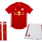


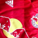
Let's start with a team that often makes a nod for its nature, the New York Red Bulls. The "Bold red" - a bit 'Man United - dominating the secondary 2018 shirt was developed by adidas and Red Bull to foment rivalry with the other team from New York (which celestial dress), the NYFC owned by the City Group. The oblique and vertical patterns in the t-shirt should recall the bridges and the streets of the Big Apple, in my opinion, you could do better.
Rating: 6+
Columbus Crew - away


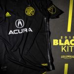
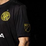
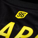


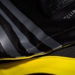

Toltal Black is never wrong. The Columbus Crew opted for a stealth style with bright yellow details, the combination works and even the sponsor does not pollute the shirt design too much. One of the details of the uniform is the patch with the inscription "Charter Member # 01" in memory of the fact that the club was chosen as the first franchise of the new MLS in 1996. Ah, if you're wondering, yes, that's the brother of Higuain.
Rating: 7.5 (you would deserve less because they did the presentation with two big cars behind)
New England Revolution - Home
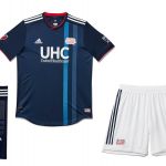

This shirt reflects my personal idea of boring, confusing and ugly American football. It combines perfectly with those fake and green lawns of American stadiums: the blue is off, the vertical stripes of two different colors are boring, the club logo seems to come out since 1991. Evil, New England Revolution (even on the name I would have things to say ), considering that it is the team's first jersey.
Rating: 4.5