Stranger Kits S01E01: AC Milan
Discovering the most hazardous, forgotten, loved and hated jersey of football clubs
Sports
October 20th, 2017
October 20th, 2017
The jersey, fetish of fans and passionate, is the object that most embodies the union between identity and style, aesthetics, and sense of belonging. An identity that is often showed off, sometimes only hint, but still present, tangible, to always state the team to support. Current football business helps to stimulate and give insights about uniforms’ restyling every year, season after season, in a Leopardian view so “things to stay as they are, things will have to change”. So here we are with several homage jerseys or uniforms that tribute glorious seasons of the past, until the riskiest experiments (third kits now mainly exists only for this latter aspect).
nss sports, always careful to players’ style on the field, decided to pick up the 5 strangest jerseys of the most important European clubs. Hazardous, forgotten, loved, hated jerseys. Anyway, out of the chorus. AC Milan's current jersey, which has soon become one of the most appreciated among supporters, is the result of a double inspiration: the Milan of 1950s, which set itself as a big national club, and that one of the golden years 1987-1998, in which the Rossoneri won everything. Here is how designer James Webb explains the origin of the concept:
Speaking about the technical sponsor, obviously, the main partnership is with adidas, carried out in three acts: 1978-1980, 1990-93, and from 1998 to now (but which is turning to the end). There have also been interesting parentheses such as the one of NR, the brand usually related to the iconic Maradona’s Napoli shirt, and that with Kappa, but in both cases, social colors’ tradition has been definitely respected with classical uniforms and a rather conservative design. It’s Lotto, in its five years of the contract (1993-98), that begins to experiment and introduces innovative elements, with alternating successes.
With a look more susceptible to aesthetics than victories or trophies, out of the rules, here are our 5 favorite crazy shirts.
Third 2015/16
The tribute to Expo 2015 resides unexpectedly not within the jersey but in shorts, the part of the kit usually less considered. Here, the colors of Expo are balanced with the sobriety of t-shirt’s solid color, and this uniform represents the best match between reality and history, zeitgeist to whom adidas holds a lot.


Home 2007/08
This is the most unusual among home kits. Narrow strips, which occupy almost only the center, and a triumph of red (rare). Behind it, neither complete strips nor free backs, but a striking mix that creates an undisturbed space for the numbers without, however, completely eliminating the classical vertical bands. The futuristic and square font contributes to a jazzy, aggressive jersey, certainly not for everyone.


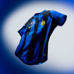
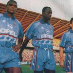
Third 1995/96
Blue is a color almost absent in Milan's history. That's why this jersey signed by Lotto clashes so much among club’s uniforms. Oddity does not reside just in color itself: even the pattern is unusual, with shade sleeves and geometric fantasies that split the t-shirt in half. Maybe too far, maybe too Inter. However, the real problem isn’t the chromatic choice, but it’s about put beside too many different ideas with excessive nonchalance.

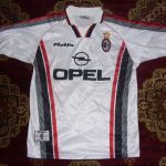
Away 1997/98
Elaboration of the classic. Here we find all the typical characteristics of a 2nd jersey, from white tint to red and black details, but it’s the use of these elements to be unexpected. The black stripes are in turn striated, that make you think of a gray gradient, while closely points to wheelbase on the asphalt. It was no coincidence that in those years there were often "stolen" features from the racing world, like the iconic Ronaldo PSV shirt, which introduced the racer style in football. Final odd choice: black name, numbers in red.
Third 2013/14
The effrontery we like. A jersey not afraid to show itself in its extravagance, that it does work. It floats in limbo between excess and control. The gold color stands out thanks to the black hips, and the fake tricolor pocket confirms the t-shirt’s rebel spirit. Don’t you like it? Try to say it to Balotelli.