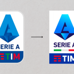
Serie A has changed - slightly - its logo
The rebranding is there but not seen, and even this time it has not yet been communicated
June 24th, 2022
With only a few days to go before the new calendar is drawn up, Serie A presents itself again with a slightly modified logo compared to the previous edition - effective from the summer of 2021. As in the case of the rebranding of AS Monaco, the change is there but only visible to the most alert and ready eyes. There is no official announcement about the change yet, but both the social pages and the official Serie A website have been updated in recent hours.

Compared to the crest of recent seasons, the new logo of the top division of Italian football abandons the roundel design and accentuates the colours, but the new brand identity remains essentially the same. What fundamentally changes is the frame where the TIM sponsor is located, which will become white on a blue background and with its logo in red. Nor will the tricolour disappear, which will be placed immediately below the 'Serie A' inscription.
It would be the eighth logo in chronological order from 1997 (year of Legacalcio's foundation) to the present day, with an evolution that tries to keep up with the times: from the simple ball symbolising a universe and a tricolour astral band to the maximum stylisation of the "A" the step is not so short. Since 2009, the TIM logo has become an integral part of the Serie A crest.


