Euro 2020 teams' jerseys with national typeface
Bodoni for Italy, Futura for Germany, Johnston for England
Sports
December 5th, 2019
December 5th, 2019
During the last international break, the first jerseys of some of the Euro 2020 national team were revealed, including the new Spain's, Belgium's and Germany's adidas jersey or the Italy’s PUMA one. adidas' new designs have not convinced, due to a too vague and weak concept inspired by art, too similar between each other. PUMA has instead shown to be in a historical moment of great creativity with respect to football jersey, presenting kits balanced in design and colors, with simple, solid but well-made ideas at the base, the first of which is the "Renaissance kit" of the Azzurri.
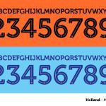
On the part of both brands, the choice of using a single typeface for all the teams wasn't convicing, limiting the expressive and artistic qualities of a decisive element within the jerseys, which occupies the entire back of the jersey and also appearing on the shorts. The only team for which an exception was made is Switzerland, for which PUMA opted for a very famous font, born in Zurich in 1957, an unusual one but consistent with the history of the nation: the Helvetica.
With the qualifying rounds already set up, we are waiting to see what the new Nike kits will look like. nss sports has decided to try and think about what the kits of Russia, England, Germany, Italy, Netherland and France would be like if fonts born inside their own borders were used. The effect is to recreate original kits, with more personality that can stand out in the field for the values they embody, giving back importance to the fonts, an element unjustly overlooked by brands and teams in recent seasons.
![]()
ENGLAND - Johnston


Created in 1916, the Johnston font is named after its creator Edward Johnston, who together with Eric Gill (creator of a very similar typeface like Gill Sans) designed an extremely modern alphabet for the time, different because it was far from the Grotesk-inspired fonts of those years.
The Johnston was commissioned by The Underground Group, becoming in effect the font of the British railway lines and later of the London underground, which still maintains the font in its "New Johnston" version for station names and directions.
There are different weights of the letters, the ITC Jonhston version for exemple, published in 1999. In 2002 an Italic variant was added while in 2008 the numbers 1 and 4 were restored to the original design, to which they are the graces have been removed.
FRANCE - Garamond


There's a huge list of fonts under the name Garamond, readjustments and small variations of the font designed by the French engraver Claude Garamond during the 16th century. Just as Johnston has a curious connection with transport, the Italian railways being one example. The font is in fact the one used by the Ferrovie dello Stato and until 1951 it also appeared on the license plates of Italian cars.
Garamond however is one of the most used fonts ever in the history of publishing, for its calligraphic style, revolutionary at the time compared to the gothic alphabets used in French engravings. Garamond has marked the history of printing and publishing for years, in particular for having been the character used by Aldo Manuzio, the greatest publisher of the Renaissance.
ITALY - Bodoni


Bodoni does not identify in particular a single paragraph but a family of slightly different versions of each other. The main detail of Bodoni is the contrast between thin lines and thicker profiles, which creates a rhythm in reading but in many cases creates some limits of readability.
Despite this "limit" the font born in Parma is one of the most used by publishing and printing on paper, thanks to its classic appearance and the precision with which the graces of the letters are made, which have made it one of the most already loved in the 1700s.
The Azzurra team used a font very similar to those of the Bodoni family, during the 2004 European Championships, when the gold of the numbers and letters contrasted with the blue of the shirt made by PUMA.
GERMANY - Futura


Probably one of the most popular fonts used by contemporary graphic designers. Since its presentation in 1933 at the fifth Milan Triennale, the character guarantees immediate success thanks to the essential style that best represented the ideas of the German Bauhaus school, thus moving away from contemporary sans-serif models. Its creator, the German Paul Renner, was successful thanks to the combination of classicism and modernity, as well as a great campaign to publicize the font - especially in the United States - which described it as "The typeface of our time".
Futura has had a very wide commercial use, becoming the official character of well-known companies and brands such as Supreme, IKEA, Volkswagen or Fox, but also in the film industry, appearing in many of the titles of Wes Anderson's films.
NETHERLAND - Museo


The Museum is a geometric font, a sans serif very readable and invented by the printer by the Dutch printer Jos Buivenga. The quality of this font is that of being perfectly studied in its proportions, so that it can be used and combined in all its dimensions. The serif of the letters are the distinctive element of this character, in particular that of the U that in the original idea of Buivenga had to remember the stem of a flower. Another peculiarity of the Museum is that of having the numbers both in upper and lower case, as well as a series of ligatures between the letters.
Nike for de Jong or van Dijk's shirt would also have available the two variants "Museo Sans Rounded" and "Museo Slab", also perfect for the Azzurri shirt.
RUSSIA - Cyrillic


More than a true font, the idea of adidas could be to rework the Cyrillic alphabet, common to all Slavic languages but characteristic of the avant-garde Russian art of the early 1900s. The origin of the characters date back to around the 9th century and thanks to its charm in recent years it has also been widely used in the fashion and streetwear industry, thanks to the collections for Balenciaga and Vetement by Demna Gvasalia, to Gosha Rubchinsky and Heron Preston.
The choice of adidas could have fallen on a Westernization of the Cyrillic alphabet, taking advantage of the increasingly close link with streetwear and with the Russian Prem'er Liga, in which the names of the players are inserted with the local alphabet.