


The 8 best music covers from 2018
Judging a record by its cover
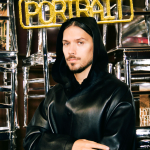
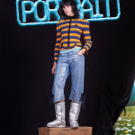
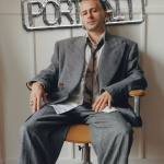
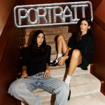
Music
February 8th, 2019
February 8th, 2019
If it is true that you should also please the eye, you won’t find music business within this article or, at least, we will try not to let it in. Probably between a round of bass here, two rhymes there, we will drive some preferences but this brand new focus comes from a different need. We thought to catch the covers of records and hits that we liked the most during these last times. It's frustrating listening to a good song and then see a horrible cover. Okay, apart from that, we want to reflect on a question: is music enough to itself?
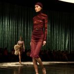
Today everything is different: hordes of graphic designers shatter from morning to night; record labels, digital PR and stylists run in search of the perfect aesthetics that will fit perfectly on the newly signed artist. Spotify itself changes every half hour the cover of his playlists and, as if this were not enough, there is also the other side, made of those who don’t give a fuck about aestethic instead, or better to say, they pretend not to care about it. So thumbs well up for photos edited with Paint by Pop X and congratulations to Calcutta using selfie and video made with his iPhone as visual artwork of his concerts, screened in front of ten thousand people and more.
Playlist – Salmo

A draft made with wax crayons, the portrait of the rapper on the cover of his last album looks like one of those cartoons that children watch on TV in the morning. The author is indeed a child of 8 years: he delivered his drawing to Salmo during a promotional venue in 2015. The rapper himself said: "there were so many expectations on this record, people thought to find a three-dimensional cover , professional, showy. Instead, me and Moab, who is the graphic designer who works with me and lots of other people, we’ve taken another direction. As soon as he saw the drawing he told me: brother, this is the cover, trust me. "And they were right: direct, simple, immediately recognizable and not at all banal: just right to be hung in Milan with embarrassing dimensions, surrounded by acrobats.
Vinavil – Giorgio Poi

No graphics for one of the most creative singer of the scene: Giorgio Poi himself designed the cover of his latest single - and it shows. The strokes of the marker are visible, clumsy. At the same time, however, the accentuated dexterity brings us so close to the author and to the song to make it feel stronger, more intensely. Only the scissors with a rounded tip and an abundant dose of vinyl glue are missing, as Giovanni Mucciaccia would say, inspired by the video. A spontaneity that has been awarded several times, the same exhibition on the cover of the album "Fa Niente" where the singer, collector of all those little things that are found in the markets, he used a photograph purchased on one of these occasions. A bit vintage, very romantic.
Buio - Jacopo Et
Another self-taught, perhaps less known, at least in appearance. Even Jacopo Et has ventured alone in creating the cover of his latest single, Buio, using Photoshop for good. A gray car abandoned in parking on a cold winter night is all we need to know, almost like a comic book remake of “Non Essere Cattivo”, the Italian movie directed by Caligari. There is no title, there is no author, only a great desolation. So ordinary to be true: digging a little we discover that, like the song, this cover is also autobiographical. Listen to it to understand.
Giovane Fuoriclasse - Capo Plaza, AVA

From a trap boy like Capo Plaza we could expect everything and instead, he surprised us with an extremely elegant work, which perhaps tells about him more intimately than he wanted: Luca D'Orso is sitting next to a Maserati, his look turned towards the high. The car is beautiful, an amazing turquoise, to leave you breathless, but the young man does not drive it, does not show off, there is sitting inside with jewels and a few girls who twerks. There is nothing aggressive, trash or striking. It almost seems like a high fashion commercial of some luxurious product, one of those that we can enjoy by flicking through Vogue or GQ. Everything is so elegant that we will remain permanently imprinted on October 18, 2017, the day the single is released. A good choice and unfortunately unique in its kind that will not be used for the subsequent releases of the rapper.
Apnea - Rkomi
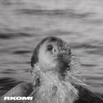
There could not be a more adapt cover for this single by Rkomi, produced by Carl Brave. A child emerges from a dive into the sea and spits water against the camera that films him, in a liberating and powerful gesture. All immortalized in black and white, on film, like the photos of when we were children. An authentic portrait collects a moment of a seemingly insignificant life. The only word that can be read on the artwork, on the lower left, is the rapper's name as if it were a different form of self-portrait. Here it is captured in an almost forgotten moment of many years before, now it seems almost another life when the limelight was still a distant dream. A photo that is both old and at the same time so current as to be able to describe the way in which the air returns to the lungs and the fight against the apnea ends and the air comes. The result? A big breath of success after all these efforts.
Mowgli Il Disco Della Giungla - Tedua

Through this record, Tedua grows and tells us about his world, the discographic world in which he’s hunted. Go ahead, work hard, be yourself. The cover is a shining mirror of all this. Mario is the main actor, here he's almost behind us as he becomes an adult Mowgli fighting his fears, or, visually speaking, a tiger called Shere Khan in Kipling's collection. Like all the tales of 1894, the songs of Tedua alternate adventure, courage and pain. The font is legendary, imposing, central, while the warm colors give us the same emotions of a movie that we look at astonished.
Lasciarsi Alle Spalle - Brenneke
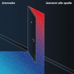
The cover used for this single is futuristic and we like it for this. A door suspended in the void: "Lasciarsi Alle Spalle" implies the definitive closure of a door, of life, or a new opening and a new possibility after what has been left behind? This artwork did not tell it right: too precise and too weird. In fact, we find out that it was edited by two architects: Michele Canziani and Eugenio Nuzzo. For how long you look at it, the answer seems elusive. The only certain thing is what it reveals: a star-shaped hyperspace illuminates the dark hallway with a new sparkling life form. We believe it is a good omen, something esoterically positive... architecturally speaking, clearly.
Polaroid - Carl Brave x Franco126

Before every - or almost - photographic shots disappeared from Spotify, leaving the place to a black and white cover with the Roman duo in plain sight, the digital account of Carl Brave x Franco 126 was studded with Polaroid, one for song, dedicated to the title of their record on which appeared a vucumprà ready to shoot, edited by Valerio Bulla. The same that are taken to tourists in the eternal city. Certainly, Carlo and Franco have not invented anything new, but have brought back in vogue one important thing: to realize a memory, doing it without digital stuff. Something that remains nailed to your daily life by an ugly magnet, something that you can burn or cut after a horrendous quarrel: the Polaroids tell us how much we were loved, happy, tanned or blurred but above all, that this was a moment that we didn’t want to forget.