


The story behind Palace's logo
How the iconic Tri-Ferg came about
Fashion
January 6th, 2021
January 6th, 2021
A clear distance could be drawn between the different stories behind the creation of logos and patterns when it comes to historic luxury houses and when instead of relatively emerging streetwear brands. If on the one hand intertwined initials and noble motifs aim at symbolizing a rich past, for the younger labels the logo is a clean slate from which to start to define their identity - without too much effort to be honest. In fact, behind the creation of the Palace logo, a logoed triangle, there is a rather simple story, recently told on Instagram by @samutaro, far from the legal diatribes that involved, for example, Supreme and the artist Barbara Kruger, from whom James Jebbia's brand drew inspiration.
Since 2009, the year in which Palace was founded, Lev Tanju, one of the founders, had a clear idea of what the brand logo should have looked like: huge, clearly visible and recognizable on the back of hoodies, on T-shirts and trousers. To carry out his project, Tanju turned to Fergus “Fergadelic” Purcell, an acclaimed graphic designer known in the London skate and fashion scene, who had previously collaborated with Stussy and Marc Jacobs. To put Tanju's demands into practice, Purcell was inspired by the iconic Penrose Triangle by Swedish artist Oscar Reutersvärd. According to the geometry texts, the Penrose triangle or impossible triangle is an impossible object, that can exist only as a two-dimensional representation and cannot be constructed in space, since it presents an impossible superposition of lines with different perspective constructions.
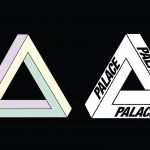
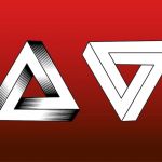

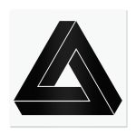
Purcell later recounted of being fascinated by that triangle, which thanks to a wise optical illusion gave the sensation of being infinite. "It looks like it’s endlessly cycling, and so I wanted to take that kind of feeling; to make a logo that had connotations of the infinite and of constant flux and movement. The shape is kind of dynamic. It won’t sit still because it’s impossible on the flat surface, so it’s got movement built into it, that’s why I chose that specifically as the triangle", told Fergadelic. So the Tri-Ferg was born, as it would later be called, a triangle with an impossible shape enriched by the Palace lettering on each side of the figure.
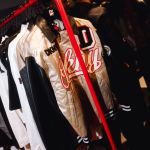
From 2009 until today the logo has remained unchanged, replicated and re-proposed in every collection, revisited and completely rethought on the occasion of collaborations and capsule collections. The shape of the logo proved to be perfect for the various joint ventures that involved Palace and adidas, in particular on the occasion of the collection created with Juventus. The Tri-Ferg has become a blank canvas for colouring, painting and rethinking, as in the case of the collaboration with Jean-Charles de Castelbajac, who added the design of three hands to each end of the figure, as a symbol of "street life, music, and above all, of brotherhood." Once again it's the Tri-Ferg that signals upcoming special projects, such as those seen in recent months, from Moschino to Rapha, passing through the charity tee in favour of the National Health Service that was struggling at the beginning of the pandemic. From Giro D'Italia to the green of golf courses and the courts of Wimbledon, without forgetting the street style and the highest fashion collaborations, the Tri-Ferg has characterized Palace in every phase and adventure.
Over the years, the triangle has in fact become the symbol par excellence of the London skate brand, re-proposed even in the architecture and in the interior design of the brand's stores and pop-ups, in Los Angeles as in Tokyo. The Tri-Ferg went on to decorate skateboards, home accessories such as trays and ashtrays, becoming an inevitable presence on hoodies and T-shirts in every collection of the brand, even in the most recent one, together with Arc'Teryx.
Palace didn't need an intricate pattern or a symbol difficult to understand to give life to identifying and powerful imagery, sealed by a logo that contains in its apparent complexity a simplicity that points to infinity.