


The history of Gucci logos
A brand's journey in three acts
Fashion
December 18th, 2020
December 18th, 2020
What is surprising in the history of a brand like Gucci is not so much the incredible commercial and cultural relevance it has and has had, but rather its ability to define and popularize in Italy and abroad the concept of luxury translating it for every era. In each of the key decades of the 1900s since its foundation, Gucci has been synonymous with luxury with an almost uninterrupted continuity. To succeed in this, the essential thing was not to fossilize into a single language, to change together with one's own times – and thus to change one's identity. Of this identity, the logo that represents the Maison is perhaps the most definitive synthesis and, wanting to trace its evolution throughout the entire history of the brand, it could be read as a three-act story that begins in 1921, in Florence, and continues to this day, on billboards, in boutiques and on catwalks all over the world.
The Origins (1921-1955)
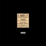
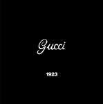

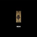
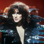
Guccio Gucci, a Florentine, had spent part of his youth working at the Savoy Hotel in London where he learned all about the tastes of the aristocracy, the best luxury products and the quality of the materials. Back in Florence, he opened his first workshop in via della Vigna Nuova where he began to produce saddles and luxury suitcases. The first brand that then identified these products was a simple label with the name of Guccio Gucci, its references and address. In 1923 the first logo was created, in italics, inspired by the signature of the founder that was quite simple and neutral to which, in 1929, was added a few flutters and putting Guccio's "G" before his surname. This logo remained one of the longest-running for the brand (it was used throughout Frida Giannini's tenure) but, in 1934, a tall and edgy one was introduced, in which an elegant hotel porter appeared with his little marsina and with two suitcases in his hand. The unusual brand did not last long, because in short, it became the basis for the next logo of the Maison.
The age of knights (1955-1992)

In the 1950s the brand looked quite different. The first boutique in Milan was opened in '51, that of New York in '53, the transfer of power to the death of Guccio in the hands of his son Aldo took place that same year. Two main events took place on the level of the logo: the first was that the actual logo on the label was replaced by a knight in the heraldic field, who held the same suitcases as the bellboy in the 1930s logo, evoking a world much higher than that of hotels, with, on his head, a rose and a rudder, to symbolize aesthetic sense and commercial avveduity; the second was that the "double G" designed by Aldo Gucci in the 1960s spread over scarves, suitcases and accessories of all kinds. In 1958, however, under the knight returned the name Gucci, in a linear and spaced character, which then became more full-bodied and equipped with thanks from 1971. It was the birth of the brand's modern logo.
The modern age (1992-2019)
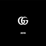
Over time, the monogram of the "double G" became increasingly famous and was re-proposed in an infinite number of different forms and versions. Finally, in the early 1990s, the "double G" became part of the official logo of the brand that remained the same until the arrival of Tom Ford at the helm of the Maison, who introduced a version with only the most tapered and spaced letters and characters. At the time the logo was printed on a black label, but only with the arrival of Alessandro Michele in 2015 the label expanded and turned white. The latest innovation introduced by Michele in 2019 is a new version of the "double G" with the two overlapping and right-oriented characters - unlike the original monogram, this is the first to also appear as a corporate brand.