


Woolrich has a new logo
A graphic redesign of the historic "Red and Black Buffalo Check"


Fashion
July 26th, 2019
July 26th, 2019
It's time for a revolution at Woolrich. After the appointment of its new CEO - Stefano Sacconi - and the change of global strategy, today the American brand unveiled an updated version of its logo.
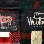
The company plans to launch the Fall 19 season, as the major labels did before, with a complete rebranding that begins with a graphic redesign of the historic "Red and Black Buffalo Check" that appeared on the first Wool Shirts. The popular pattern created in 1850 that combined the classic Scottish tartan, a tribute to the origins of the founder of Woolrich, John Rich, and the American roots of the company, will be replaced by a more minimal design. The project developed by London-based creative studio Pentagram headed by Paula Scher opts for a black and white color scheme with clean, regular lines and a font that mixes Gotham and Saa Series.
A result that celebrates the simple but functional aesthetics of the American outdoor brand and in some ways, recalls its previous logos. Going back in time, in fact, the first signature image of the label was a fat sheep featuring Woolrich lettering. Later, in the 1960s, the same animal assumed a geometrical shape. This small change was actually the mirror of the evolution of the brand that from a company mainly focused on wool became a leading reality in the use of technical fabrics such as Gore-Tex and DuPont. The logo with check pattern dates back to the 90s, when it became synonymous with the iconic Arctic Parka model. Now Woolrich is still changing, but without forgetting its roots.