


10 things you probably didn't know about the Swoosh
From its inspirations to the real price of the best known logo in sportswear
Fashion
April 11th, 2019
April 11th, 2019
Nίκη, daughter of the Pallant Titan and the Nymph Styx, the personification of victory. If you think about it, everything seems perfect, if this is the starting point.
Actually, the history of the most recognizable logo on earth has a few fun facts, some very well known, others less so.
Nike is now identified with its logo which in turn has become a symbol and an integral part of the culture of sport.
The Swoosh is a striking example of how a "vision" has turned a company into a reliable brand.

Nike is based in Beaverton, Washington County, Oregon. The company was founded in 1964 by Bill Bowerman and Phil Knight, but the company changed its name from Blue Ribbon Sports to the current Nike in 1971.
The company takes its name from the Greek goddess of victory, Nike, of which the Greek poet of the eighth century, Hesiod, speaks for the first time, in the above work the Theogony: in the War, he contends with the Titans, Zeus named her the leader of his chariot. It was celebrated on the occasion of victories in athletic or artistic competitions but also in war clashes but it is the sculptor of the sixth century BC. Archdemon to represent it for the first time, winged.
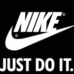
The Nike logo is a symbol but the equally famous claim "Just Do It" has often been added to the Swoosh. The font used seems to be Futura Bold Condensed Oblique with slight modifications, there is a slight inclination of the letter K to make the text distinctive and more visible. The word Nike was written in Futura bold until 1995, after which it was removed. The Swoosh remains the only identifying logo of the company registered by the brand in 1995, since then, the Nike symbol is the identity of the company.
We, therefore, decided to put together 10 things you (probably) don't know about the most famous and influential logo in history.
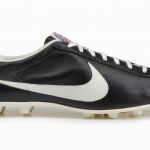
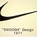
1. "The debut" of the Swoosh
The logo made its first public appearance in 1971, on a soccer shoe, "The Nike", it cost $ 16.95 but could not withstand the cold or the rain and fell into oblivion. It was only the beginning, he lost the race with other brands much more rooted in football - like adidas and PUMA - and this was the moment when Nike began to focus more on running, tennis and basketball.
2. "The Sript"
Originally the logo was called "The Sript", immediately modified permanently into Swoosh. The name recalls a sound we hear when something passes by us quickly. This word is synonymous with speed and movement, which is why the logo has a shape that shows a range of motion.
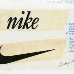
3. The Swoosh cost $ 35
The Nike logo was designed in 1971 by Carolyn Davidson, a graphic design student at Portland State University. In 1969 pressed by a tight deadline and hearing the complaints due to her economic difficulties (she didn't even have the money to buy oil paints) the young accounting professor and head of the Blue Ribbon Sport, Phil Knight, approached her and asked her to design the logo of a new line of shoes, Nike. Carolyn was paid only $ 35 ($ 2 per hour, as agreed with Knight) for creating the logo that has become one of the most recognizable icons in the world.

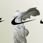
4. The wings of the Nίκη
The Swoosh design is inspired by the wings of the goddess of victory Nίκη, representing its shape. Hesiod and AArchdemon who lived between the 8th and the 9th centuries BC decisively influenced the world's number one company.

5. The colors of the Swoosh
The logo was originally not black as we see it today. For a long time, Nike used a red and white palette. The reason behind this is simple: red represents energy, passion and joy while nobility, purity are expressed by white. Later, in 1995 the color scheme changed and the current black was chosen to make the Swoosh more elegant.
6. "Just Do It"
The claim "Just Do It", perhaps the most well-known slogan of all - ranked in the top 5 advertising slogans of the 20th century - was inspired by the words of Gary Gilmore, a Utah serial killer who was sentenced to death in 1977 for having robbed and killed two men, Gilmore would have exclaimed the phrase "let's do it" just before its execution. It was revealed by Dan Wieden, the man who invented the claim.
7. The challenge was with adidas
A designer always takes a customer's competitors into consideration when designing a logo. This is because a logo creates an identity that must be distinguished and differentiated from the competition, Carolyn knew that adidas was the company with which Nike wanted to compete. The adidas logo had three lines that became larger at the angle. She liked the idea of angulation, which represented energy and movement. But instead of three separate lines, she only designed one giving a feeling of continuity in the single space.

8. Over 17 hours of designing
The Swoosh is a symbol of simple appearance, but simplicity is more difficult to achieve. It took Carolyn 17 and a half hours to design the logo.
Davidson stated in an interview that the real challenge was to convert the idea of a shoe into a logo. The Nike symbol had to "fit" on the shoe. But it was a challenge that, after some time, we can judge as won on all fronts.
9. The Swoosh design was rejected several times
The Swoosh was not accepted immediately. On the contrary, the owners of the company simply did not like the design at first sight. When Davidson presented the sketches, they asked diplomatically if she had any other drawings to show. It was a refusal, in no uncertain terms. Disappointed by the reaction, Davidson made several attempts to improve the logo. However, Knight was not satisfied with the design. In the end, Davidson gave up improving it and closed the project, Knight chose the Swoosh as "the least bad".

10. Perhaps the Swoosh was the highest paid logo ever
In a sense, Carolyon Davidson can be considered the highest paid designer ever for designing a logo. When the Nike logo ended, Nike owners paid $ 35, $ 14 a day. But Phil Knight realized how much the Swoosh played a key role in Nike's growth as a leading global company and in 1983 organized a surprise party. Knight gave her a gold ring that had a diamond in the shape of a Swoosh but not only, she also received 500 stocks of the company as a gift. At that time, the share price was $ 18,000, now those shares are worth more than half a million dollars; considering all this it was probably the highest price ever paid for a logo.