


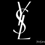
The monogram of Saint Laurent
A new collection of bags reminds us of the importance of the iconic logo of the French fashion house
Fashion
April 10th, 2019
April 10th, 2019
If suede was said to be a material reserved for the cold season, then today that myth has been demolished. The fabric becomes synonymous with vintage, elegance, refinement and, for this reason, it is perfect with any climate. This is confirmed by Saint Laurent, which launches a collection of bags for summer 2019 made of suede: bucket, satchel and camera bag, in black and burgundy. Available starting from $ 1,850, the bags are made even more precious by the monogram of the brand, especially aged to have a retro look, printed all over.


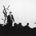
Unmistakable, recognizable, iconic. Few things like the logo or the monogram of a brand impress it in the mind, yet another example of how an image can be more eloquent than many words. The history of the YSL logo is intrinsically linked to one of the brand and its designer. We are in 1961 when Yves Saint Laurent and Pierre Bergè, his partner and life partner, commissioned Adolphe Mouron Cassandre a drawing capable of expressing the elegant, disruptive and revolutionary style that, a little later, would have made them enter the history of fashion. Of Ukrainian-French origins, a pupil of the École des Beaux-Arts in Paris, Cassandre alternates the work as a painter with commissions as a commercial poster artist and typeface designer, becoming very popular in Europe and in the United States during the 1930s for the extraordinary covers made for Harper's Bazaar and for having invented some daring characters including the Bifur and the sans serif Acier. Strongly influenced by Surrealism and Cubism, he will prove to be the right man to rework the aesthetics of Saint Laurent. For the Maison he creates a unique font, breaking the unwritten rule of not mixing two apparently incompatible typefaces in the same word. Cassandre, in fact, blends, with exceptional harmony, serif and san serif, roman and italic. Furthermore, in a fluid way, it manages to connect all the letters from left to right, giving the whole an original graphic identity until then. The same philosophy is used by the artist for the legendary logo, which uses the three initials of YSL in a vertical arrangement.

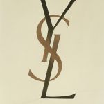
For over four decades, since they were used for the first time in 1963, Cassandre's creations remain, unchanged, Saint Laurent's graphics, becoming in the world the symbol of the brand itself, signs capable of embodying and representing luxury, quality, style at the same time, even from the equally iconic double “C” by Chanel. The various designers who follow the creative direction after the death of Yves, in particular, Stefano Pilati, continue to celebrate that particular weave of YSL as a tribute to the founder of the Maison, inserting it not only in advertising campaigns but also in clothes and accessories. At least until the arrival of Hedi Slimane.