Zara has a new logo but nobody likes it
Re-branding flop?
January 28th, 2019
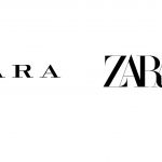
After luxury giants like Burberry, Celine, Saint Laurent, Balenciaga or Balmain, even from Zara it's time for a new logo (Such a widespread choice that we talk about loss of identity logos). In contrast, while most of the luxury companies opt for a minimal appearance and for the sans-serif character, the Spanish retailer goes in the opposite direction proposing overlapping and sinuous letters.
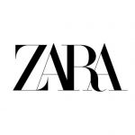
The novelty is the work of the advertising agency Baron&Baron, founded by the French publisher and artistic director Fabien Baron, best known for his work on Madonna's Sex Book, Interview Magazine and Harper's Bazaar. It is no coincidence, then, that someone has noticed the similarity between the Zara logo and that used by the fashion magazine. That said, Rebranding is now a habit, often used to signal a renewed artistic direction and, sometimes, an unprecedented aesthetic vision. Whether this is the case of the low-cost chain, no one expected such negative reactions to the change of logo design that, for the record, is in its third version after that of 1975 and 2010. The unusual combination of overlapping letters , with "Z" and "R" particularly accentuated has triggered various criticisms on social media. The most widespread opinion is that the graphics are unclear, not readable. Someone writes that it seems there is written, instead of "Zara", the word "Zaba" which in Polish means "frog", while there are those who are unbalanced by defining the operation
"The worst-design of the year, and is only January ..."
Zara have updated their logo. pic.twitter.com/GhhQziNV1D
— It’s a Fabio ⁂ (@fffabs) 26 gennaio 2019
A part of the other users, instead, preferred to ironize, joking about the analogy between the peculiarities of the logo and the thinness of the testimonials. In short, reading the various comments, it seems that the new "ZARA" does not like anyone, what do you think? Was it better to avoid a renewal that seems too little thoughtful?


