


The fashion logos and their lost identities
A smart marketing strategy or just a way to forget a bulky past?
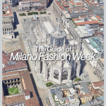
Fashion
December 7th, 2018
December 7th, 2018
When you broke with your girl/boyfriend, the temptation to throw away all the signs of the past is strong, as well as the will to rewrite a new present, at the cost of losing memories that probably still have a lot to say. Many fashion brands in recent years of deep development and changing, seem to have broken up with their past and with their founders' legacy, to be found more and more with the magnifying glass, and the first step was to change the logo, the way in which fashion houses impose their presence.
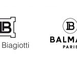
The debate came back once again in these days. In fact, the last in order of time to have deleted part of its tradition was the historic French fashion house Balmain, led by Olivier Rousteing, who has decided to change the iconic logo with another version, that what the graphic designers call Sans Serif. The look changes completely, the typographic elegance recedes to a state of greater readability and immediacy, as well as other fashion houses did in the last year. The only flaw is the embarrassment in admitting that the new logo is very similar to the one of Laura Biagiotti. Yes, very similar. Very, very similar.
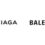
The last re-branding operation in fashion was made in September by Celine, now to be written without the accent on the first E now, by decision of the new Artistic Director Hedi Slimane, who had already upset the image of the fashion house Yves Saint Laurent, which since 2012 is just Saint Laurent, replacing the famous intertwining of initials. From that moment on other brands have adopted this strategy, starting from Galliano, who changed the name Maison Martin Margiela, not in its essence but by eliminating the name of the Belgian designer, who was no longer involved in the brand's creative processes. Raf Simons, Creative Director of Calvin Klein since 2017, has continued on the same path, simple font and immediate impact, as well as Demna Gvasalia at Balenciaga, with a Univers Bold Condensed that has invaded all the recent items. Fendi, Givenchy but also and above all Burberry, shaken by the choices of Riccardo Tisci, who modified the font following the Sans Serif trend.

In an era in which the personality of the designers is the main reason of the success of a brand, more than in the past, as well as the logo-mania of recent years, changing the logo - the greatest sign of existence and presence of the fashion houses - exploiting a stronger visual power, allows designers to get rid of the founders' ego, and start a new story. The choice, in fact, involves historical fashion houses, anchored to a long tradition, different from those that are the contemporary needs. Moreover, a stylistic choice that so clearly focuses on anonymity allows brands to be able to adapt every time to what the market, the campaign or the clothes requires, getting rid of preconceptions.
All that remains to do is to take a stand, loyalist traditionalists of an identity modeled throughout the seasons, or modern supporters of the fashion industry's chameleonic ability to update.