The stunning Nike's font for France
Small designer details like this one make a shirt remarkable
Sports
March 21st, 2018
March 21st, 2018
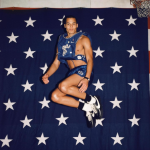
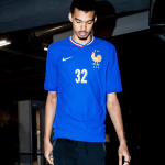
For the majority of people the font used on a football shirt is just a negligible detail, but for us - enthusiasts of typography - it represents one of the most identifiable style elements available to a designer. For the 2018 World Cups, the big brands - and in particular Nike - seem to take the issue very seriously: after having told you about the concept of the adidas font and all the work behind the design of England's, today it's another turn pretender to the world title: France. Last week, Nike unveiled the French national team uniforms through an official presentation fan the French rapper Niska worn the shirts during the same night at one of his gigs.

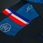
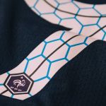


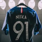
Thanks to the pics posted on Instagram by Niska, it was possible to appreciate the original font used by Nike for the shirts which had not been revealed in the official presentation. France 2018 World Cup typeface features a unique style. The font is white with a navy line and the FFF crest on the bootom. The most remarkable element of the font are the light blue hexagons, inspired by the geometric shape of France - the France 2018 World Cup jerseys feature the phrase "Nos Differences Nous Unisset” (Our Differences Unite Us) inside the collar of the jersey housed in a hexagon.