


The history of Milan subway's signage
Bob Noorda and Franco Albini's masterpiece
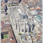
Lifestyle
June 18th, 2021
June 18th, 2021
An integral part of the daily life of Milanese commuters, the Milan Metro tells a story that combines talent and design in the creation of a model that started from the Milanese city to become an example all over the world. The talent in question is that of Bob Noorda, a Dutch-born who arrived in Milan in the 1960s as a freelance at Pirelli. In those years the Higher Council of Public Affairs started the works for the Milan Metro, assigning the architectural finishing and interior design project to Studio Albini of Franco Albini, Franca Helg and Antonio Piva in 1962.


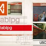
In addition to being one of the first cities to adopt a metro line, that of Milan, inaugurated on November 1, 1964, was created independently of the other city infrastructures, thus putting Noorda in front of the enormous challenge of creating something from a new but on the other hand, able to fit into the urban context of a city in continuous development. The turning point of the project was the possibility of working on the signage project together with the architectural one, thus putting into practice the use of the Rationalist philosophy already used by Noorda in his works. Eliminating the superfluous, the cornerstone of rationalism was the key in the realization of what Noorda already had very clear as “an interface where products and services must speak to citizens in a synthetic language”. The design of the orientation, identification and information graphics led Noorda and Albini to elaborate a combination of station furnishings and indications for travellers that took shape in the system of coloured bands designed to host the necessary information. 25 cm high and placed at the top to distinguish them from advertising billboards, the bands extended along all the walls of the station distinguishing themselves by colour according to the line they belong to red-orange for Line 1 and light green for Line 2.


However, Noorda's real intuition was to repeat the name of the station every five meters on each coloured strip, thus making it easier for passengers to read while the train was in motion. The legibility of the bands obviously also had an impact on the choice of font, a customized variant of Helvetica created by Noorda himself, hand-drawing 64 letters and different signs to make it functional to his needs. The last work assigned to the Dutch designer was, however, the only one that did not go through, the logo of the Milanese Metro conceived by Noorda as two reflecting "M" that represented the top and the bottom, while the shape would have taken up that of the handrails present in the wagons. “It's the only thing that didn't work out," Noorda commented. "There was a president who was opposed to this brand, which Albini really liked instead." Despite a recent rediscovery and enhancement of the project, over the years ATM and the city administration have partially upset the work of Noorda and Albini both in the design of the new lines and in the maintenance of the existing ones.


Upon the death of the Dutch designer, which occurred in 2010, ATM had decided to re-propose the original font used in the project, renamed the Noorda, contributing to a recognition that not only from the rest of the world (cities like New York have used the Milanese project for the local metro ), also came from the same Milanese city: in 1964 Noorda and Albini won the coveted Compasso d'Oro awarded by ADI, the same association that recently inaugurated its museum in Milan, dedicating a space to the Milanese Metro project. Obviously, the history and career of Bob Noorda are not limited to the Milan Metro, but he is intertwined with the daily life of each of us through symbols and logos that are now part of our life. His are the brands and coordinated images of companies such as Coop, Agip, Enel, Ermenegildo Zegna and many others, including the coat of arms of the Lombardy Region created with Bruno Munari, Pino Tovaglia and Roberto Sambonet.